The Focus
In a bid to build a modern wellness-based pain management brand, Hedso Health And Wellness created “Hoop”, which caters to the millennial’s bid to “be the best version of themselves”.
With modern problems requiring modern solutions, Hedso wanted Hoop to be a proactive brand that made healthcare enjoyable – as opposed to extremely functional, clinical options that have dominated Indian markets.
They approached the team at Elephant to develop a brand identity, packaging graphics and a wide-ranging system that would incorporate their pain-management portfolio of offerings, while making room for newer releases.
The Design
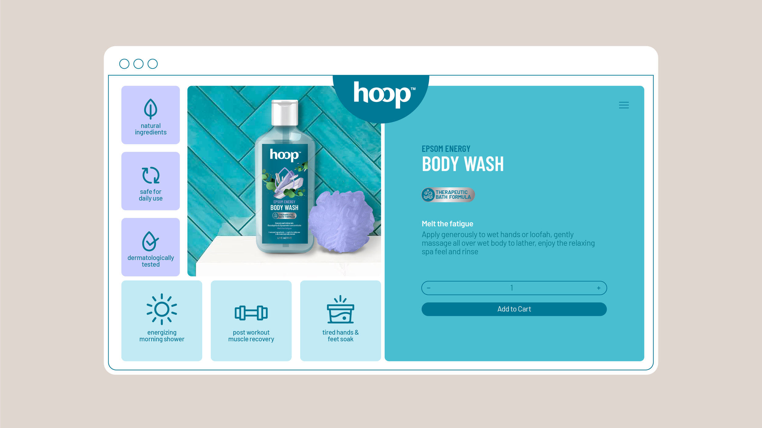
The Elephant packaging design team first developed a brand identity by using the word ‘Hoop’ and its innate connotations of energy, movement and flow. The ‘O’s’ overlap, creating ownability and the font was geared for approachability.
The packaging system deviated heavily from typical “problem + solution” codes, where no negative, pain-filled depictions were shown. Dark Teal was an appropriate base colour for the brand as it was distinct and very much in line with the target audience’s emphasis on neutrality and subtlety.
A combination of creative mnemonics, metallic inserts for efficacy and premiumness and due focus on ingenious active ingredients ensured that Hoop stood out and directly dealt with new-age pains while garnering immense praise for the results.
The Story

In the dynamic world of wellness and pain management, Hedso Health And Wellness embarked on a journey to create a modern brand that would resonate with millennials. They envisioned "Hoop" as a proactive, lifestyle-focused pain management brand, aiming to make healthcare enjoyable and relatable for the younger generation. Our team at Elephant was entrusted with the task of developing a brand identity, packaging graphics, and a comprehensive system that could accommodate Hoop's diverse portfolio of pain-management offerings and future releases.
Insights
Hoop emerged under the umbrella of HEDSO, targeting a demographic that sought to "be the best version of themselves. This forward-thinking brand was a departure from the traditional, clinical options dominating the Indian market. Hoop aimed to address modern issues impacting younger audiences: symptoms of contemporary lifestyles like stress, sleeplessness, workout-induced pain, and more. Unlike the dated, overpowering product options in the market, Hoop's objective was to provide an "on-the-go" appeal, offering effective solutions without compromising on enjoyable, proactive self-care. These insights were essential and shaped our design solution in numerous ways.
Looping Energy
Our journey began with creating a brand identity that encapsulated Hoop's essence. We harnessed the innate connotations of the word "Hoop," symbolizing energy, movement, and flow. The overlapping 'O's' not only created a unique visual identity but also conveyed a sense of connection and reliability, positioning Hoop as a go-to friend rather than a clinical advisor. The typography we chose made the brand approachable, combining sans-serif for a fresh, innovative touch.
Giving Form to Modern Wellness
Our packaging design for Hoop was a significant departure from the conventional "problem + solution" approach, avoiding negative, pain-filled depictions. This aligned with newer audiences and their expectations, who did not resonate with a strong, reactive and technical approach that had dominated the industry. We opted for a distinct Dark Teal as the brand's base colour, aligning with the millennial audience's preference for subtlety and neutrality.
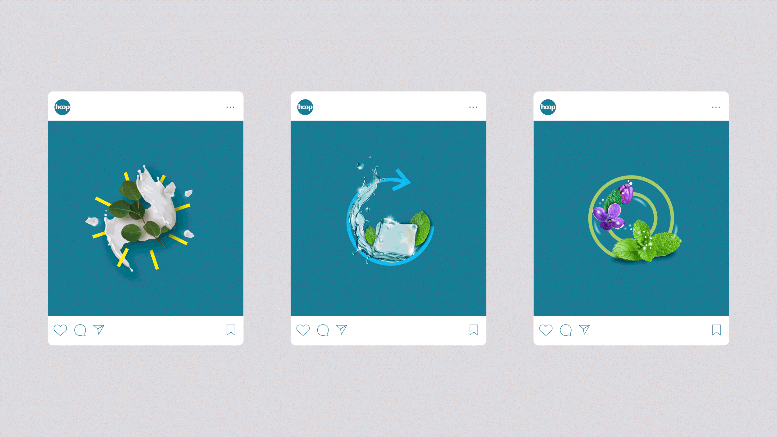
Our packaging system was guided by two core principles: relatability and trustworthiness. Hoop was positioned as a reliable support system, featuring active natural ingredients prominently. Each product was assigned a unique mnemonic symbol, intricately tied to its benefits. For instance, the Pain Relief product featured a blue arrow curving inward, symbolizing the transition from pain to soothing relief. We used metallic inserts to highlight efficacy and premiumness subtly, showcasing differentiators like "Cryotherapy Formula," "Natural Headache Support," and "Aromatherapy Blend."

A Proactive, Adaptive Lifestyle
Hoop's product portfolio catered to a wide range of needs, from pain relief to body wash and sleep assistance. Adapting to this diversity, our packaging system incorporated unique codes and mnemonics that reflected the specific category and enhanced product recall. We seamlessly bridged the gap between proactive and reactive healthcare, ensuring that each product communicated its purpose clearly.
To demystify the unique ingredients used in Hoop products, we integrated storytelling elements into the brand's nomenclature. Symbols and mnemonics were inspired by the brand's tagline, "Live Active," adding depth and character to the packaging. From Epsom Body Wash to Cinnamon/Menthol Pain Relief, every product told a compelling story, making it easy for consumers to understand the benefits.
The journey of creating the Hoop brand identity and packaging system was an exciting collaboration between Team Elephant and Hedso Health And Wellness. Hoop emerged as a vibrant, modern wellness brand that speaks directly to millennials, addressing their lifestyle-related pains and ailments in an enjoyable, proactive manner. The brand's unique identity, relatable packaging, and innovative mnemonics ensure that Hoop stands out in the competitive wellness and pain management landscape. It embodies the essence of being a trusted companion on the journey to holistic well-being, making healthcare an enjoyable part of daily life.