
Maharshi Ayurveda
Repositioning An Age Old Ayurveda Brand in The Modern Market

An up and coming sector, Ayurveda is quickly becoming a crowded space with newer as well as heritage brands jostling for consumer mind space. ‘Maharishi Ayurveda’ has been a legacy player in this market and with changes in the operating ecosystem, had begun to slowly lose its relevance with modern consumers.
The brand’s core equity lay in its heritage: using knowledge garnered from Ayurveda to help people maximise their potential. The brand’s philosophy is that Ayurveda harnesses the power of nature to bring out the best in people. As the brand had lost connect with changing times, Elephant Design was invited to refresh and reposition the Maharishi Ayurveda brand in a contemporary manner, targeting modern, urban Indian consumers.
The project scope included building the brand thought, philosophy, defining/positioning the brand & taking the new positioning forward through crafting a refreshed visual identity (logo) and packaging a graphic design system for the product portfolio.
Through our repositioning exercise, we were able to position the brand as helping people unlock their lives to their full potential. The brand's approach enabled it to direct professional applications of Ayurveda towards making life holistic, thereby improving its quality.
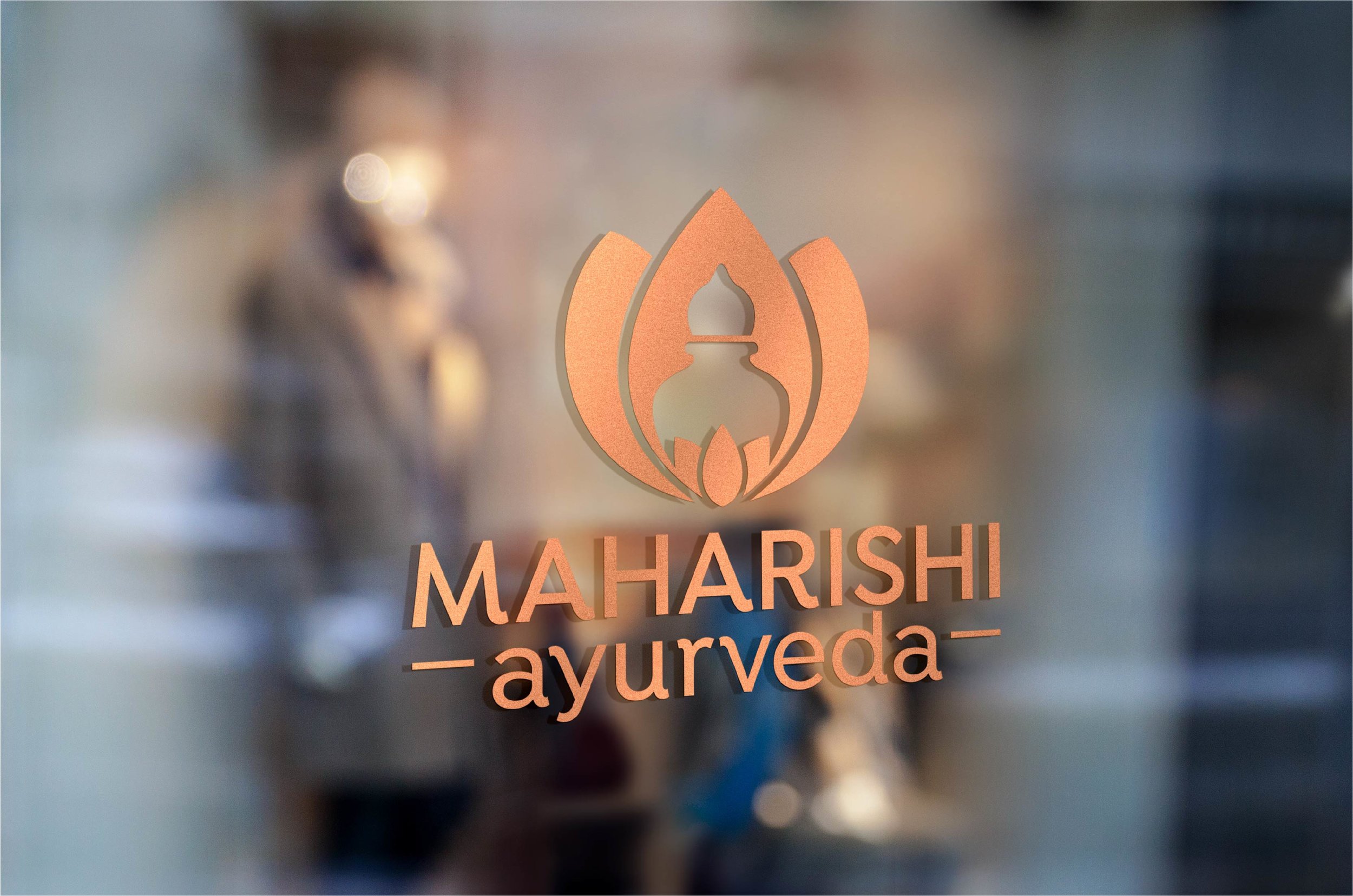
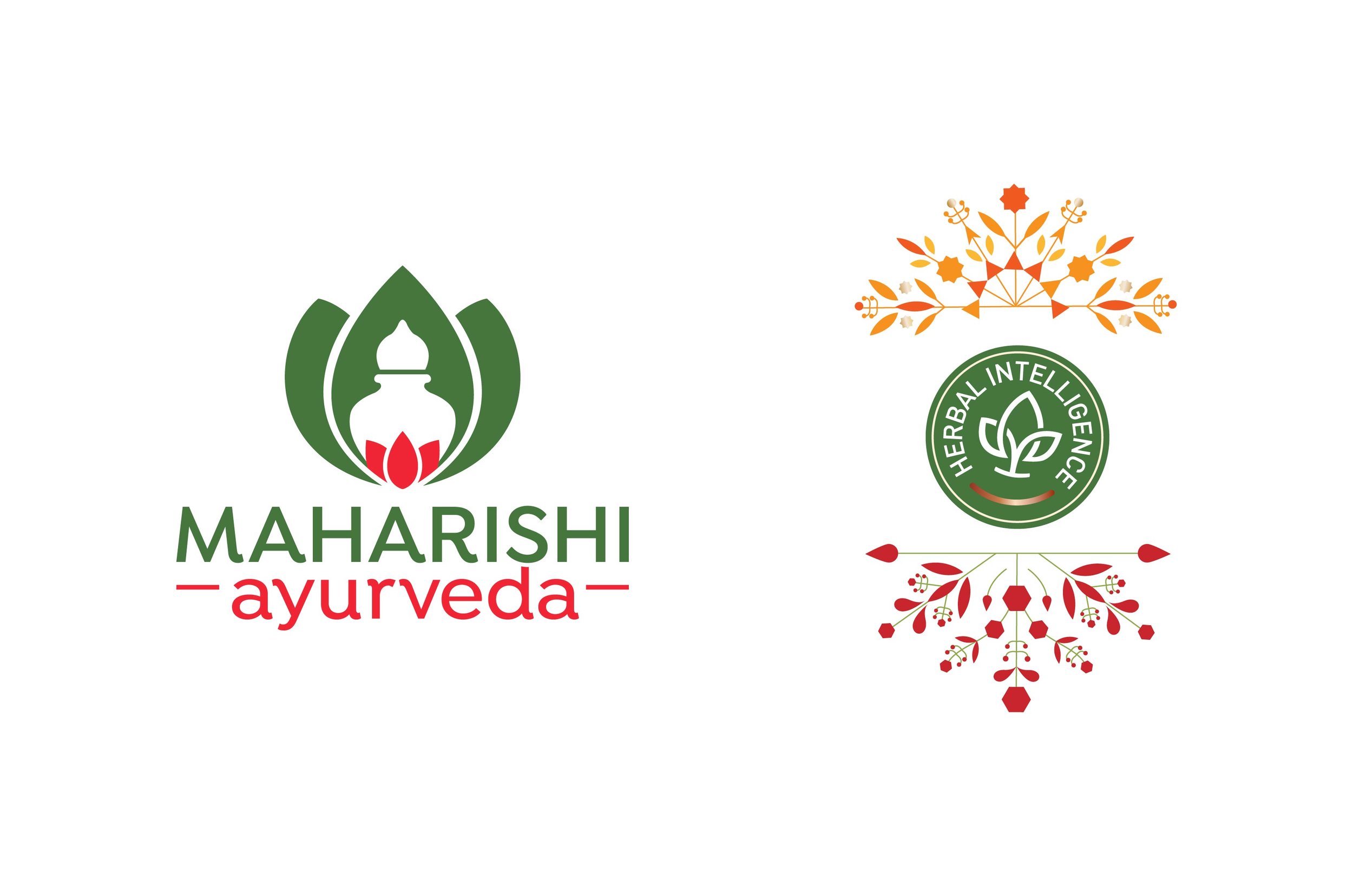
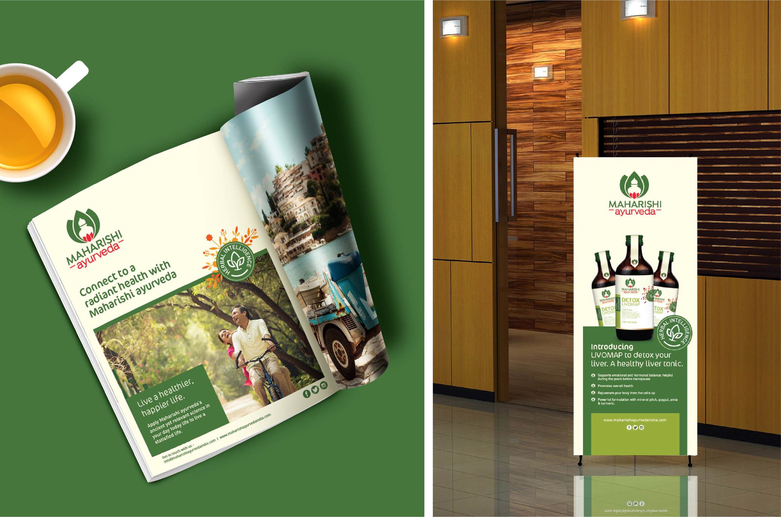
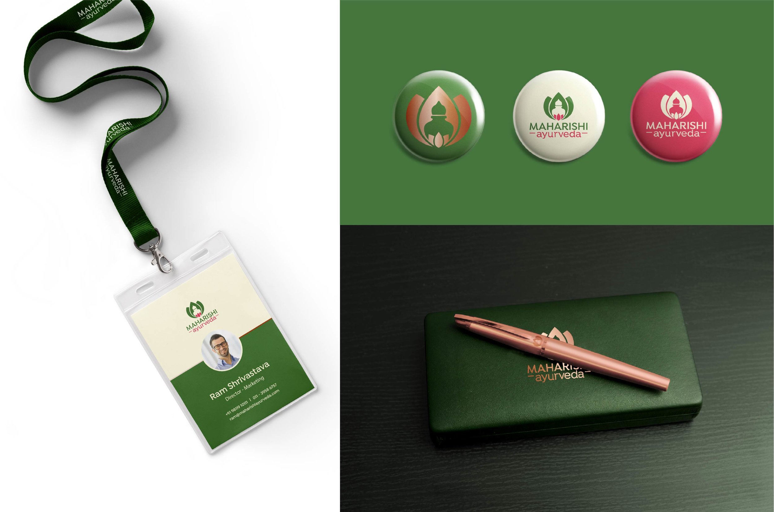
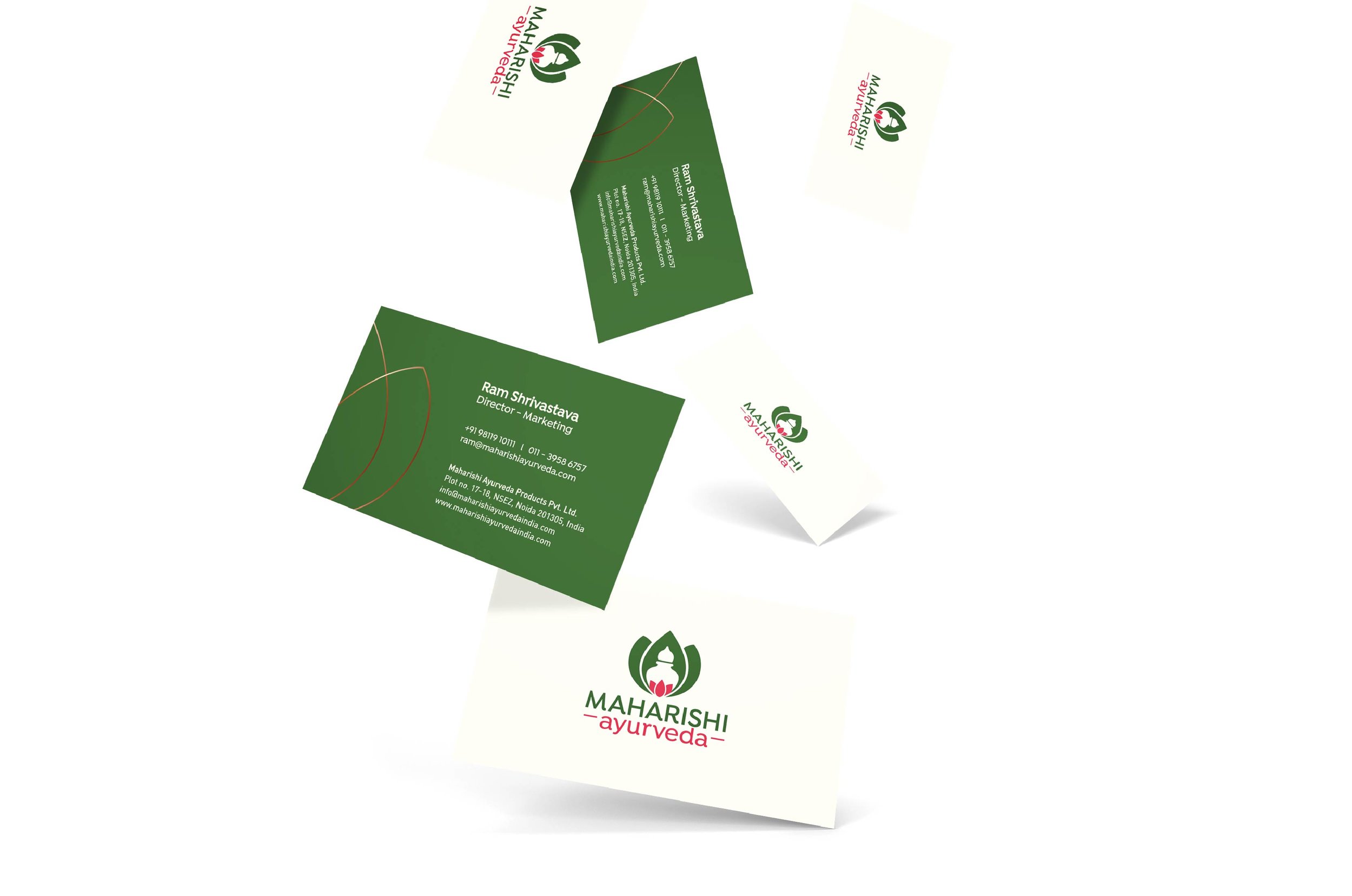
Once the brand positioning concept was crafted, it was then used as a platform for refreshing the brand’s visual identity. Old heritage codes of the brand were retained to build brand equity while contemporising it. The logo is an amalgamation of the Kalash from the earlier identity with the naturally elegant form of the Lotus. It stands for ‘divine purity of the mind & body’ and represents ancient Indian Ayurvedic wisdom based on nature’s power. The three outer petals represent the three doshas: vata, pitta, kapha, while the three inner petals represent inner strength & enlightenment. Symmetry represents harmony of proportions & balance, which aligns with the promise of Maharishi Ayurveda.
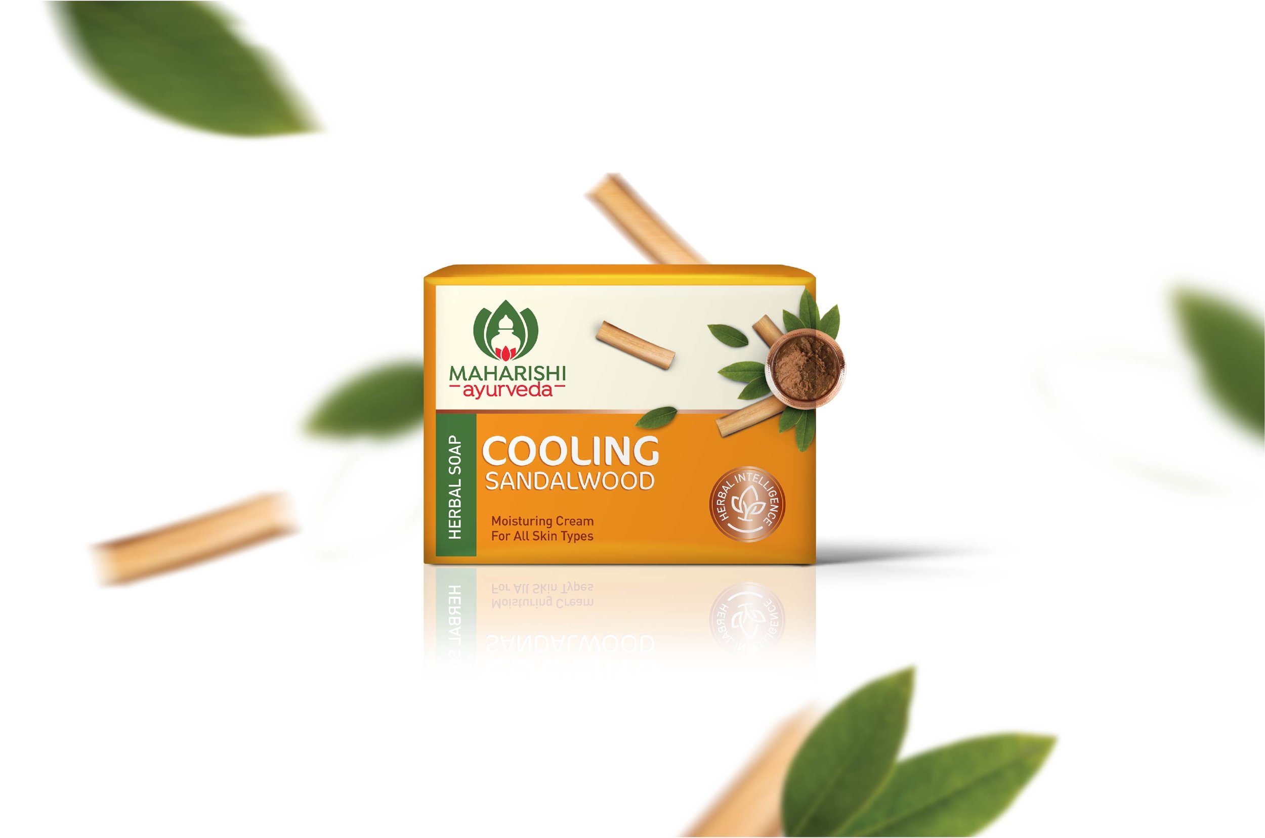
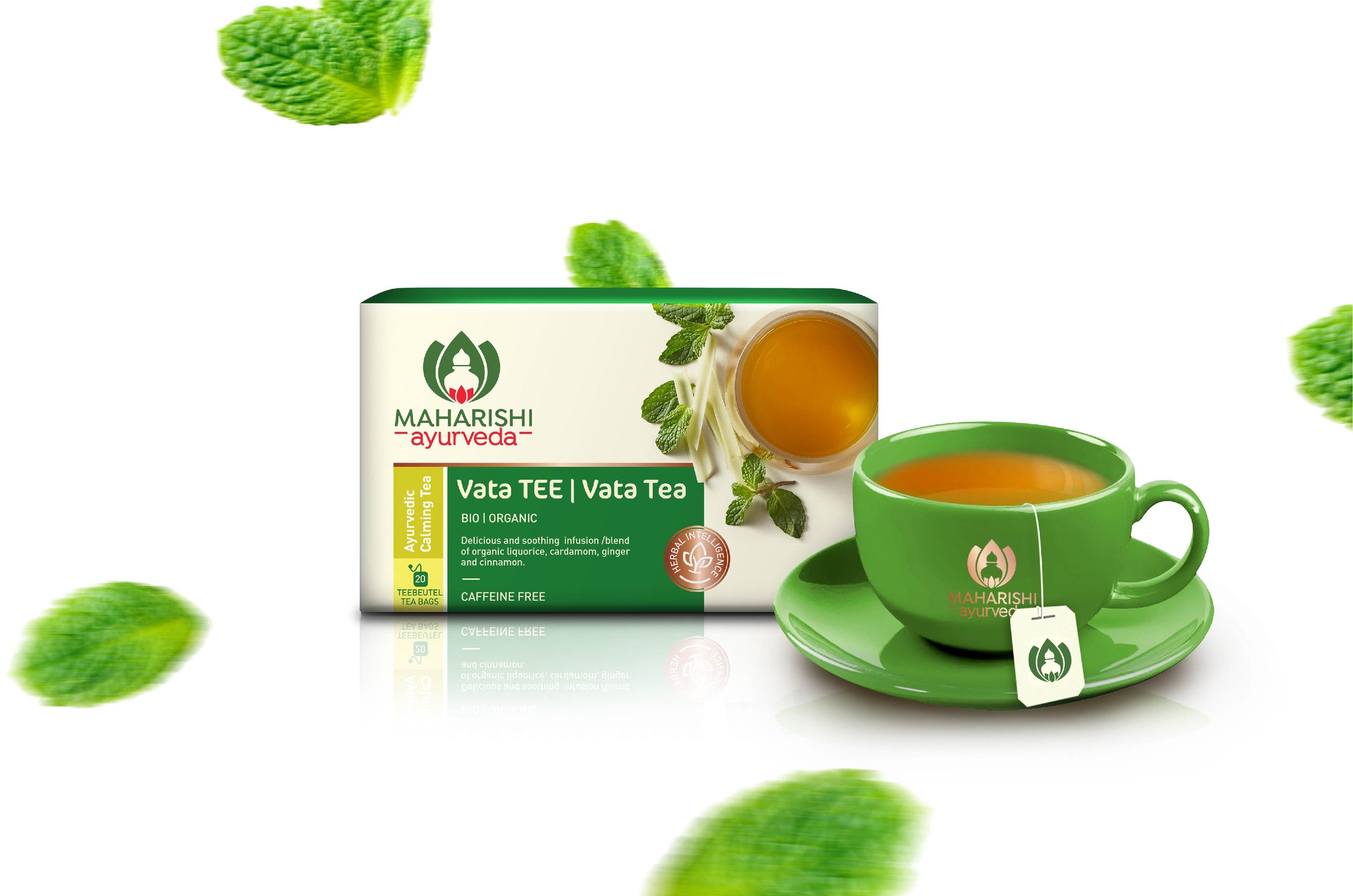
After the visual identity was complete, we created a packaging system for the company’s product portfolio. Personal care product packs were designed to appeal to younger consumers and bring causal consumers looking to try Ayurveda into the fold. The packaging was designed to be vibrant and contemporary. The prescription medications and health supplements part of the portfolio on the other hand were designed to look mature and subtle, highlighting the natural properties
they advocated to communicate efficiency & natural codes.
Currently, Maharishi Ayurveda is in the process of executing the refreshed positioning. They have begun to implement their new visual identity throughout their product portfolio.