
Marie
Completing tea time with Marie
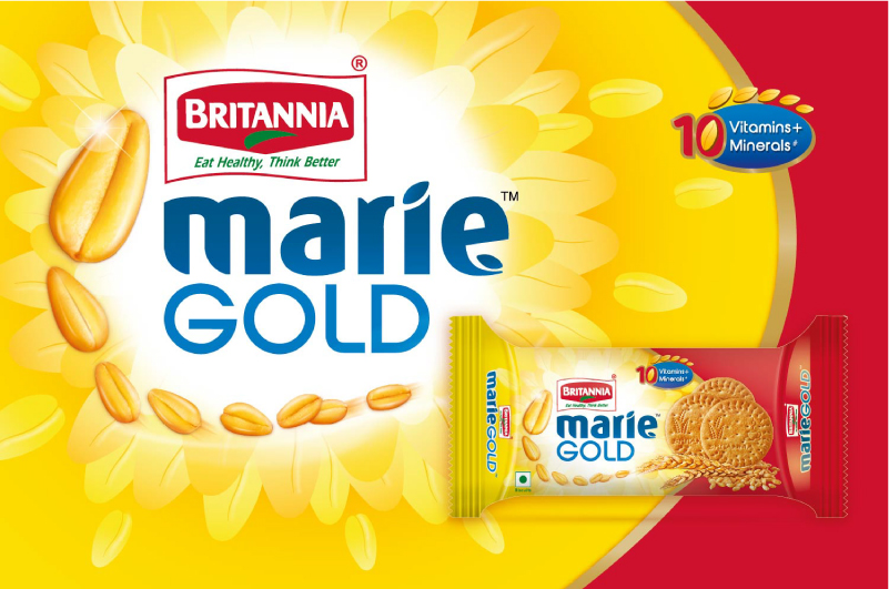
The generic name bestowed upon all tea time biscuits, Marie wanted to reinvent itself to keep up with the times. A strongly value driven brand, they wanted to amplify wheat as their primary ingredient.
Workshops were conducted with the Britannia team to arrive at multiple design decisions like color palette, connotations for indicating morning, health claims and logo spaces.
To retain the brand familiarity, we kept the colour scheme of the pack intact. A vibrant glow behind the brand was infused, allowing for a connect with morning tea time rituals. The brand name was redesigned in a double deck for a greater shelf throw and contemporary appeal.
We needed to make wheat the star of the pack, talking about the health benefits. Hence we added abundance of wheat through the biscuits gently stacked on multiple sheaves and a string of wheat grains dynamically placed around the brand name.
Through the new Marie biscuits, we tell a story of how a crunchy Marie biscuit dipped in a steaming cup of chai adds oodles of health & delight to the start of the day.