

The Focus
Nexus Malls, a mall management brand, wanted to shift from being a B2B brand to a B2C brand with a connect to its existing mall sub-brands
Nexus also desired an entirely new brand identity that reflected this shift.
Nexus would morph into a master brand connecting with retailers, customers and industry stakeholders.
The Design
The team at Elephant worked with the themes of “Happyness”, rediscovery and a deviation from the virtual world to develop Nexus’ new identity.
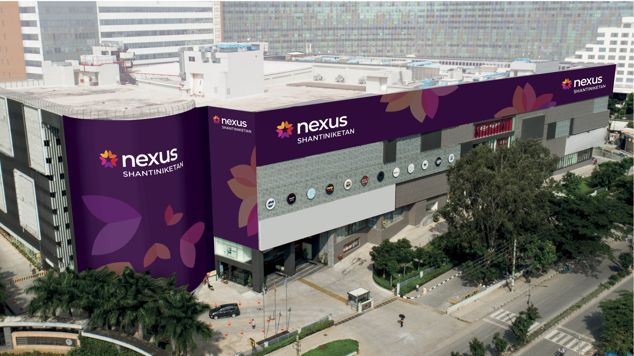
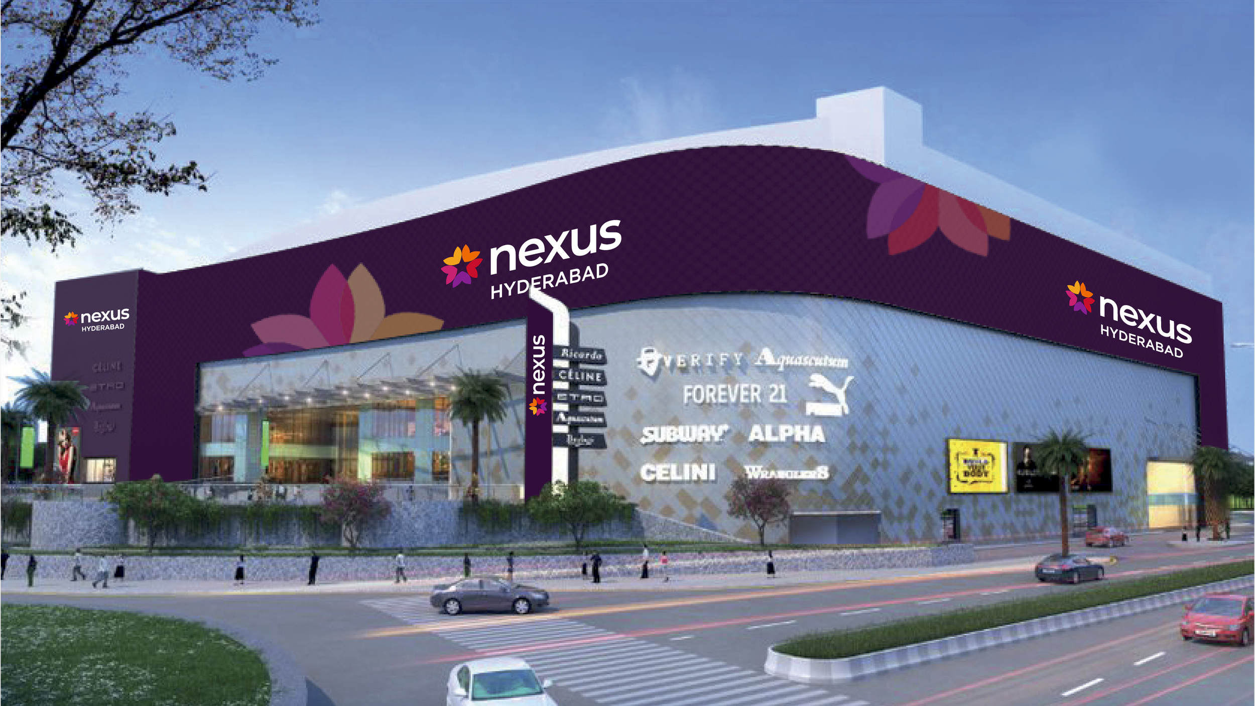
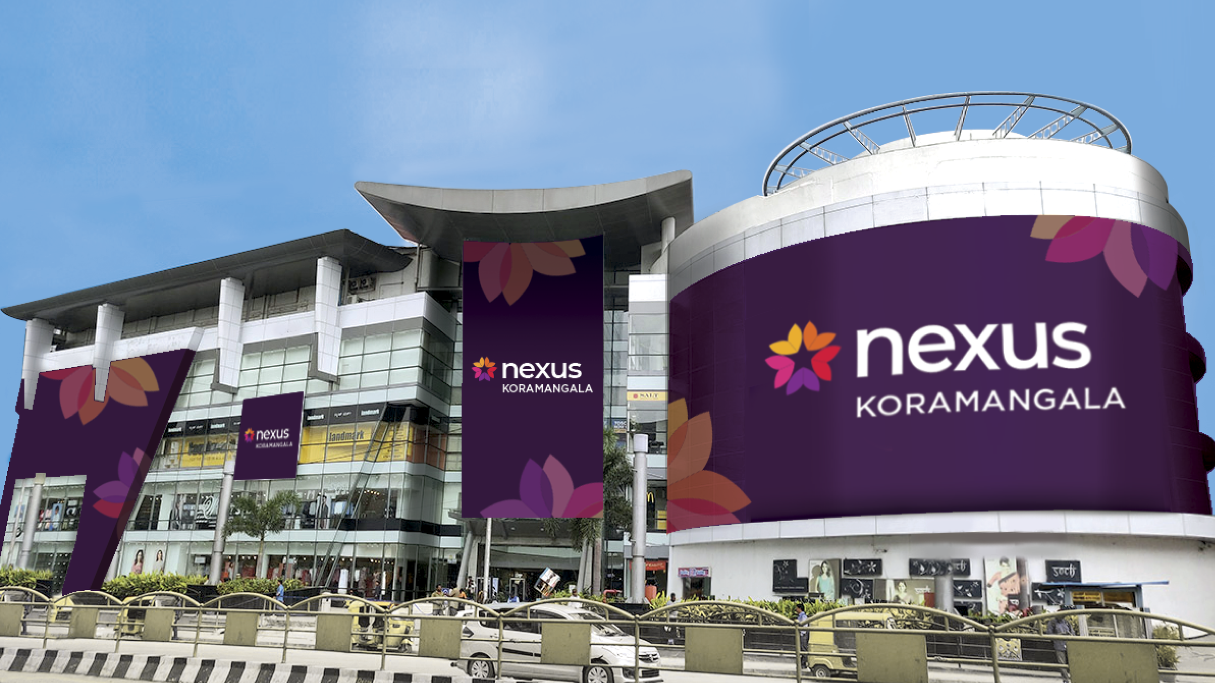
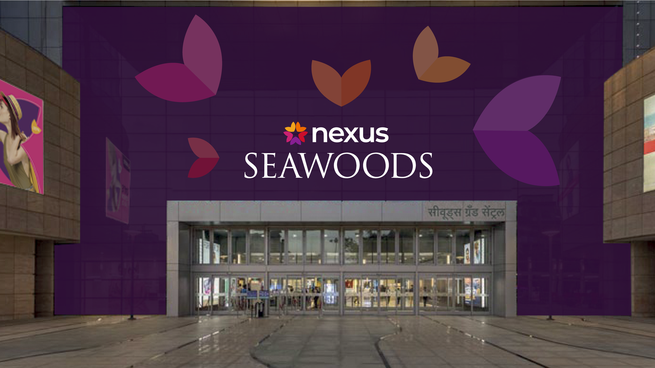
The brand symbol is now a multicoloured bloom that comes together around a central negative space (indicating the customer’s significant role) around which their experiences revolve.
We successfully repositioned Nexus as a B2C master brand, with flexible elements that allow for wide-ranging applications. In its new avatar, Nexus is approachable, lively and motivated to curate the best experiences for its stakeholder.
The Story

The Indian “mallscape” has many layers to it. With globalisation hitting India in the 90s, many ‘modern’ malls now litter cityscapes all over the subcontinent. Historians even point to the fact that the first mall in India, Spencer Plaza in Chennai, has been bustling since 1864! Exceptions aside, we can firmly say that mall culture as we know it is relatively young here.
Within that context, Nexus is a late entrant to the mallscape. Representing one of the largest investment firms in the world, the Blackstone Group, Nexus made its foray into the Indian market in 2016. However, its age hasn’t deterred its ambition. Within six years, it now possesses over 10 million square feet of prime retail space in the country. It has taken over the management of iconic malls like the Forum Mall and Shantiniketan in Bangalore, apart from having a solid presence in metros like Pune, Ahmedabad, Mumbai, and Chennai.
Nexus’ urge for expansion led them to rethink its brand identity and positioning. Earlier, they were perceived as a B2B brand, appealing more to stakeholders and retailers. But with Nexus owning and operating newer, more iconic malls, they decided that a shift to B2C was essential.
Nexus approached the team at Elephant with this brief: Design a completely new brand identity that indicated a complete shift from B2B to B2C. Additionally, it needed to have the makings of a master brand that connected with sub-brands, customers, retailers and stakeholders alike.
The Indian Mall Ecosystem
To look for an appropriate brand position, the team immediately began with a deep dive into the mind of the Indian consumer. Our category audits and stakeholder analytics revealed that the Indian consumer did not prioritise the retail/shopping facets when visiting malls. Instead, they focused on the mall environment and the experiences they derived from the additional infrastructure.
Customers expected an elevated experience containing the element of hospitality within it. Malls represent an escape, a refuge from the humdrum of everyday life. For the urban dweller, they become spaces that provide a pleasant alternative to an increasingly virtual, digitised world. These expectations stack on top of the core promise of malls providing a high-quality retail experience, replete with deals, the discovery of new lifestyles, aspirations and more.
The team noted that as far as shopping and browsing are concerned, malls face competition from an assortment of local bazaars, noteworthy legacy stores and eCommerce portals.
Lastly, customers also connected more with master brands/umbrella brands, which became synonymous with quality, variety, delight and satisfaction.
The Pursuit of Happyness
Using the findings from our research phase, the team decided to reposition the brand around the core premise of ‘Rediscovering Zest for Life’ under the Happyness space. Nexus firmly connects with its customer base, where its properties create and deliver happiness.
The identity also speaks to the younger generations that increasingly occupy the mallscape. It invites them to escape from their virtual world and immerse themselves in the real one. It helps them find work-life balance and satisfies their need to move away from routine and stagnation.
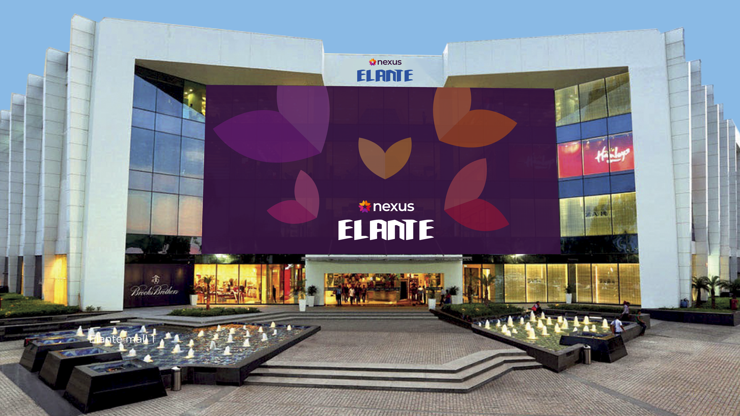
Elephant’s new identity for Nexus, then, becomes one that encourages them to live a colourful life, where they’re motivated to embark on a journey of rediscovery. We used a highly vibrant and eclectic palette for Nexus’ visual identity. The base colour, purple, celebrates a sense of pride, luxury, cheer, and independence.
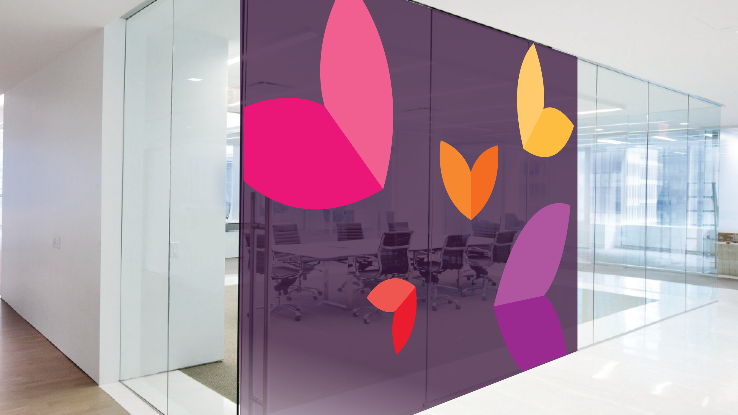
Meanwhile, the Nexus logo has numerous secondary colours – yellow, orange, pink, red and purple. These radiate energy, the zest for life, and harmony, making the brand immensely approachable. Each colour also signifies a deeper subtext and connects to an assortment of Indian cultural elements, festivals, campaigns and more.
Each colour is associated with a petal. These petals unite to make the brand symbol: a blooming flower, which contains the hues of life itself. We retained the negative space at the heart of this petal, filled by the consumer and their mutable desires. This alludes to Nexus’ commitment to customer service, where each action revolves around consumer interests.
Newer Horizons

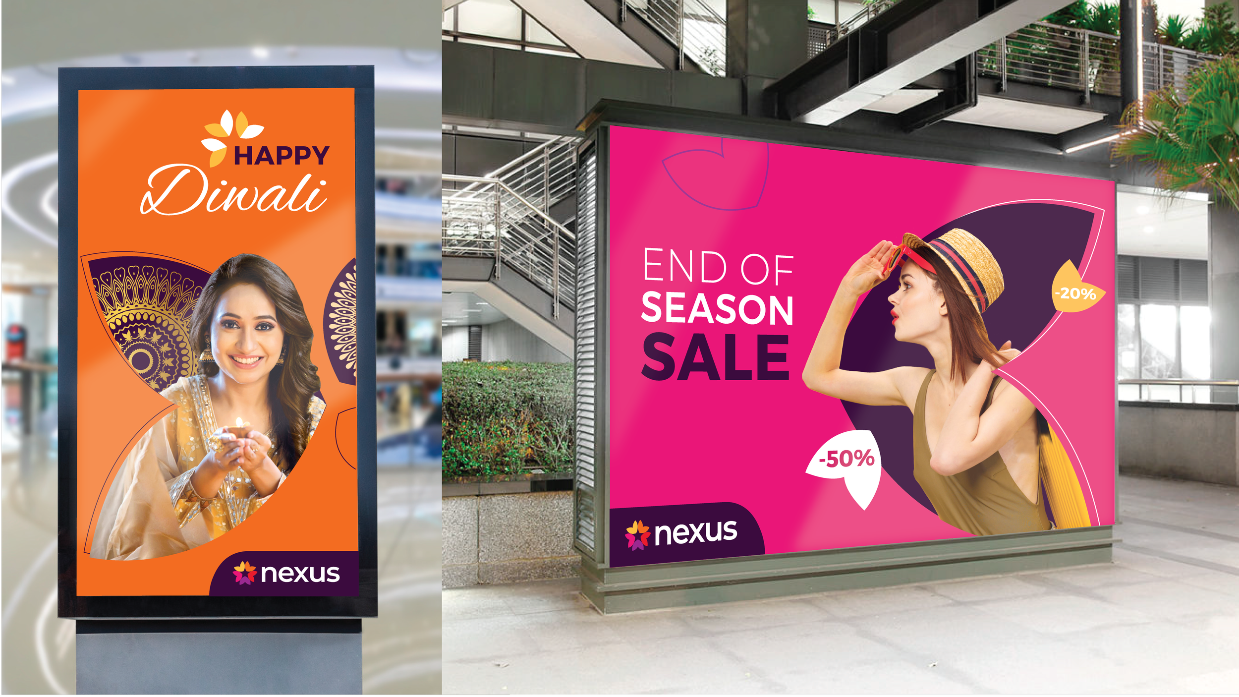
Nexus received its new identity enthusiastically, where the shift from B2B to B2C was crystal clear. Its clean minimalism and vibrant palette ensured that its applications were nearly limitless.
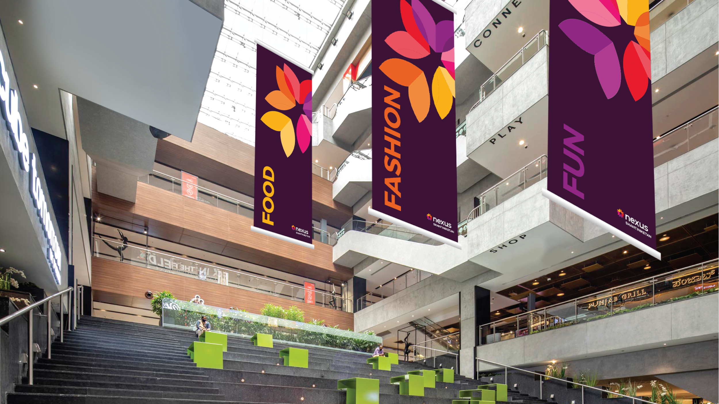
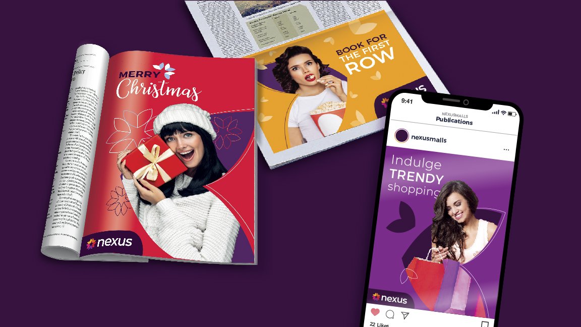
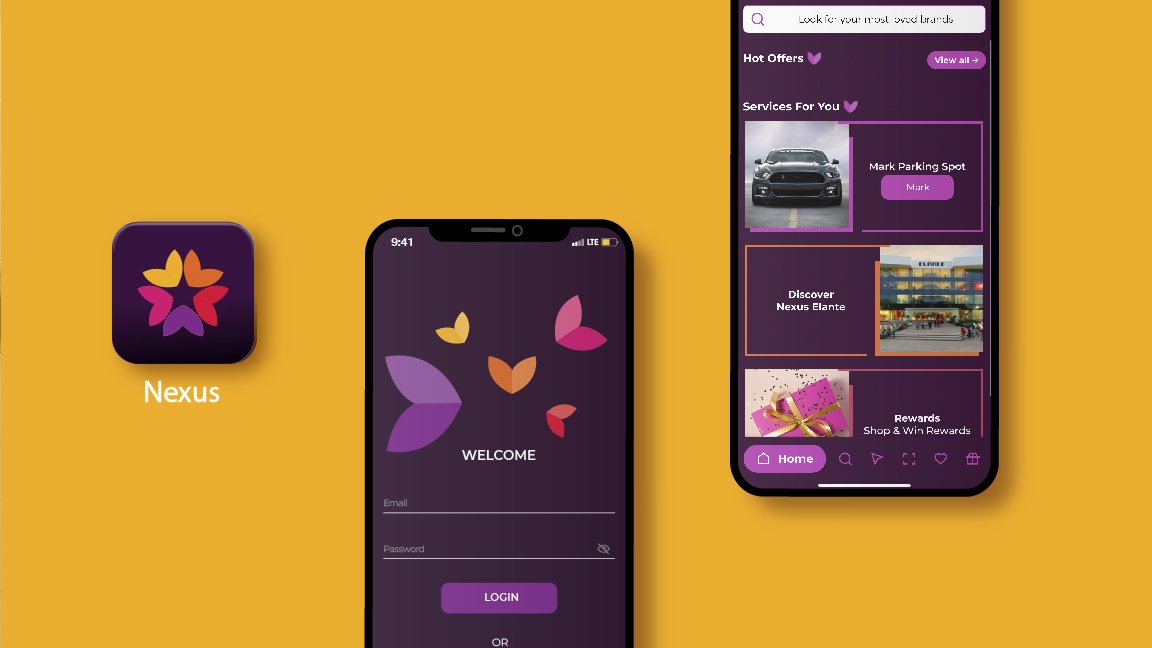
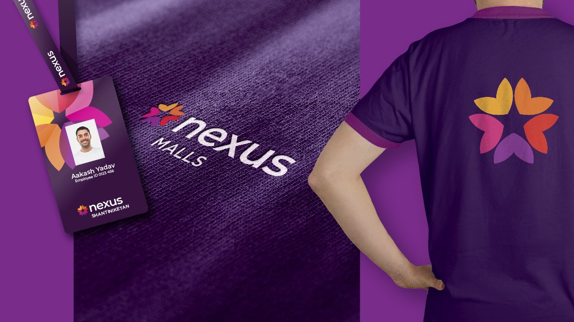
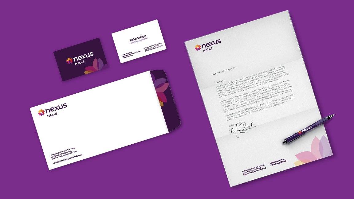
Nexus could use different variants for small-scale collateral like letterheads, signage systems, and campaign posters. The identity also holds up across larger, outdoor marketing collateral, virtual estate like its website/social media pages and livery without any loss in impact.
We expect the implementation of this identity over time, where the brand’s warm, inviting presence shall encourage more visitors. It shall also accurately reflect its promises of providing them with a much-needed escape, where a Nexus mall becomes their go-to haven.