

The Focus
Mankind Pharma, one of India’s leading pharmaceutical brands, identified an opportunity in the Pet Food space and decided to create a brand, ‘PetStar’ in the mass-premium space
The brand would adhere to new trends unfolding within the Indian ecosystem, targeting the ecosystem of Pet Parents who deviated from pure-bred dogs and focused on Indies and Rescues.
The team at Elephant worked with Mankind to develop a visual identity, packaging system and brand strategy for PetStar which would greatly assist its launch, creating a splash.
The Design
Elephant helped position the brand in the mass-premium space, where its tonality would strike a fine balance between functionality and playfulness.
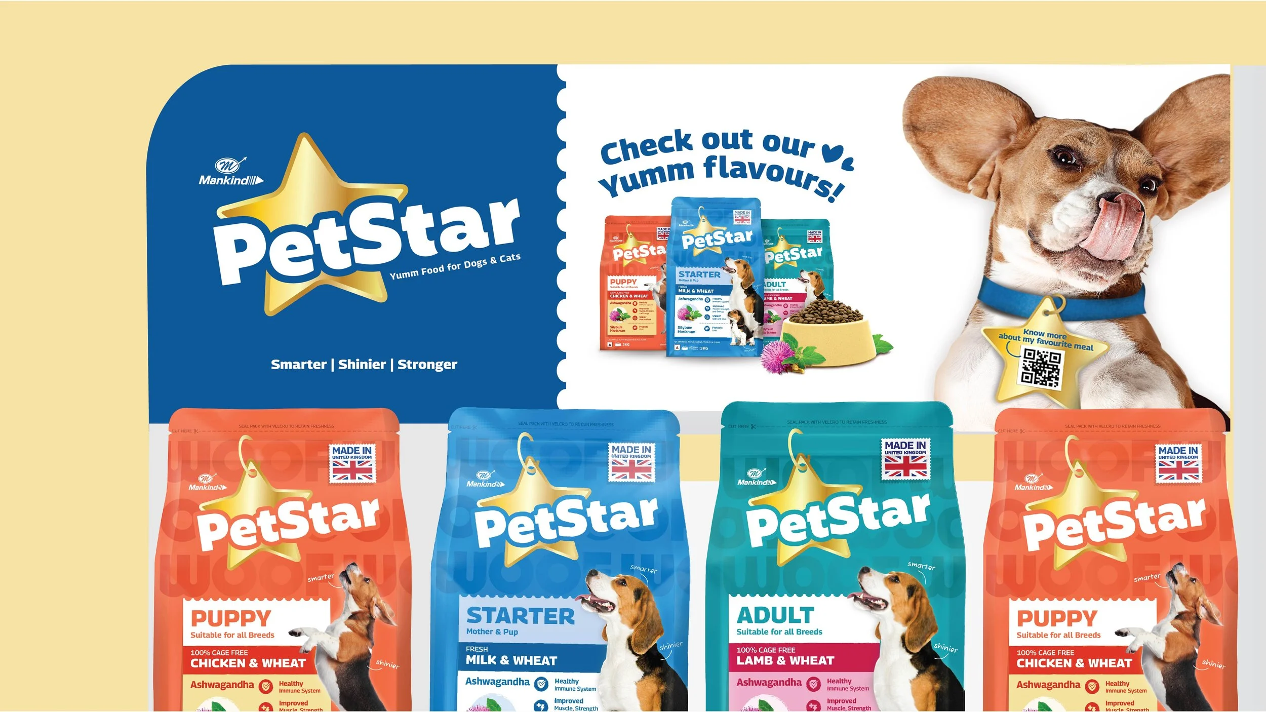
The team integrated Scientific-yet-premium cues in the design language, reinforcing Mankind’s expertise and legacy in the pharmaceutical space. The star element takes centre-stage, with a post-it-styled compartment that educates consumers on ingredients and benefits.
Other unique highlights include: a unique Indian-ingredient focus, a textured background layer, a letter to pet-parents in the back and an ownable category colour with a twist – keeping the beagle as an ownable pet-visual that doubled as a mascot.
The Story
Mankind Pharma is a household brand in India with popular OTC products like Acnestar, Gas-O-Fast and Prega News. While already in the business of manufacturing pet medicines, they saw an emerging opportunity in the Pet Food sector. There was a marked shift in consumer focus. While breed-obsessed pet owners still exist, there is a marked rise in ‘pet-parents’, whose attitudes towards pets come from a place of looking at them as partners and not simply commodities. There is also a surge in pet-related activism, especially against cruelty and the harsh urban environments that street animals often experience – amplifying NGO and individual activity when it comes to rescue, rehabilitation, vaccination and more.
“The team worked with an existing brand name – PetStar – helping Mankind with brand strategy, the development of a visual identity and in designing a packaging system that would carve a space for them within the pet-nutrition industry that was slowly filling up with newer players. ”
Simultaneously, the overall increase in pets has led to a larger influx of pet food brands, most of which are international. Other favourable indicators are the rise of pet-related occupations like groomers, trainers and walkers; with the elite consuming more and more from the pet fashion and cosmetics categories.

“A balanced approach between playfulness and seriousness reflected in our palette for their packaging design, which utilized a variety of colours while also infusing it with scientific codes. While a standard blue is often used within the category, we decided to opt for a slightly different shade to make it an ownable, distinct colour. ”
All of these trends led Mankind to approaching the team at Elephant for a joint project: the creation of Mankind’s own Pet Food brand. We worked with an existing brand name – PetStar – helping Mankind with brand strategy, the development of a visual identity and in designing a packaging system that would carve a space for them within an industry that was slowly filling up with newer players.
The Star of the Show
After extensive research, the team advised that PetStar take a balanced approach between overt playfulness and stern functionality. This would reflect within the identity, packaging and other visual design elements – apart from the brand tonality when it came to communication.
This reflected in our palette for their packaging design, which utilized a variety of colours while also infusing it with scientific overtones. While a standard blue is often used within the category, we decided to opt for a slightly different shade to make it an ownable, distinct colour.
“The team decided to contain both: ingredients and benefits within a post-it style element. This educates consumers about the category and enables quick decision-making upon purchase. Since PetStar also uses Indian ingredients like Ashwagandha, this becomes another differentiating factor and grounds the brand firmly within the Indian landscape. ”
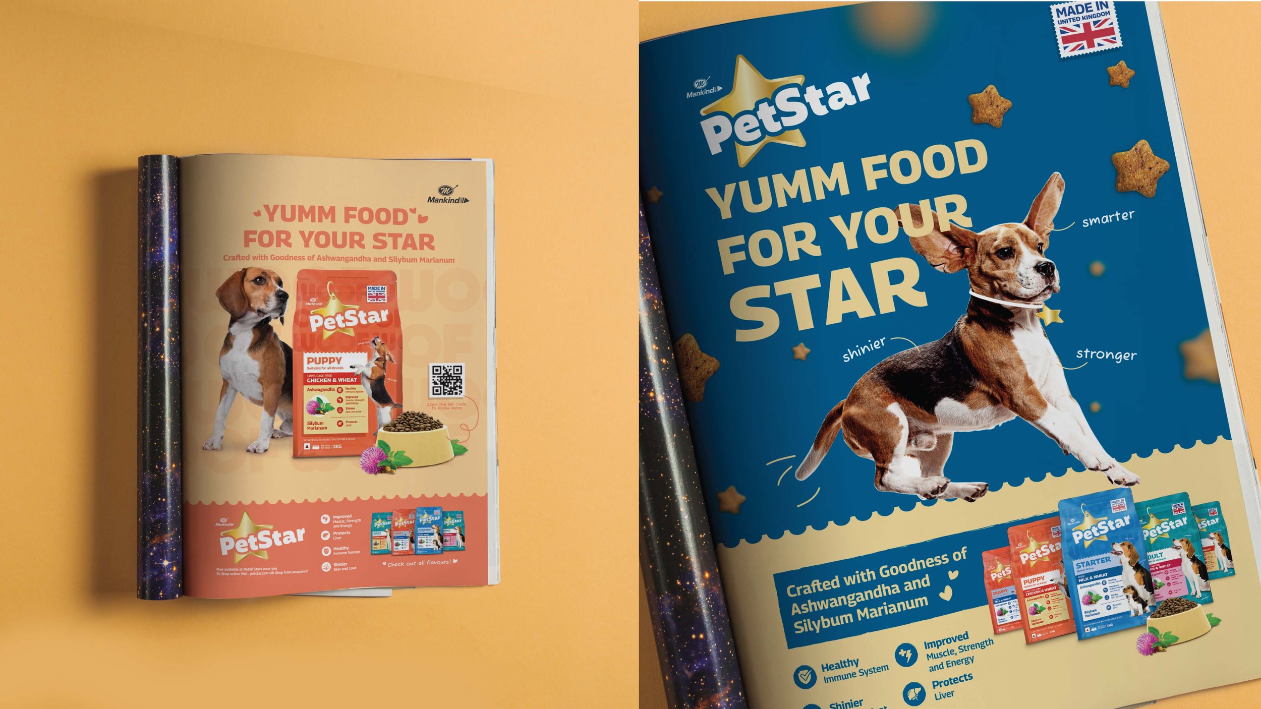
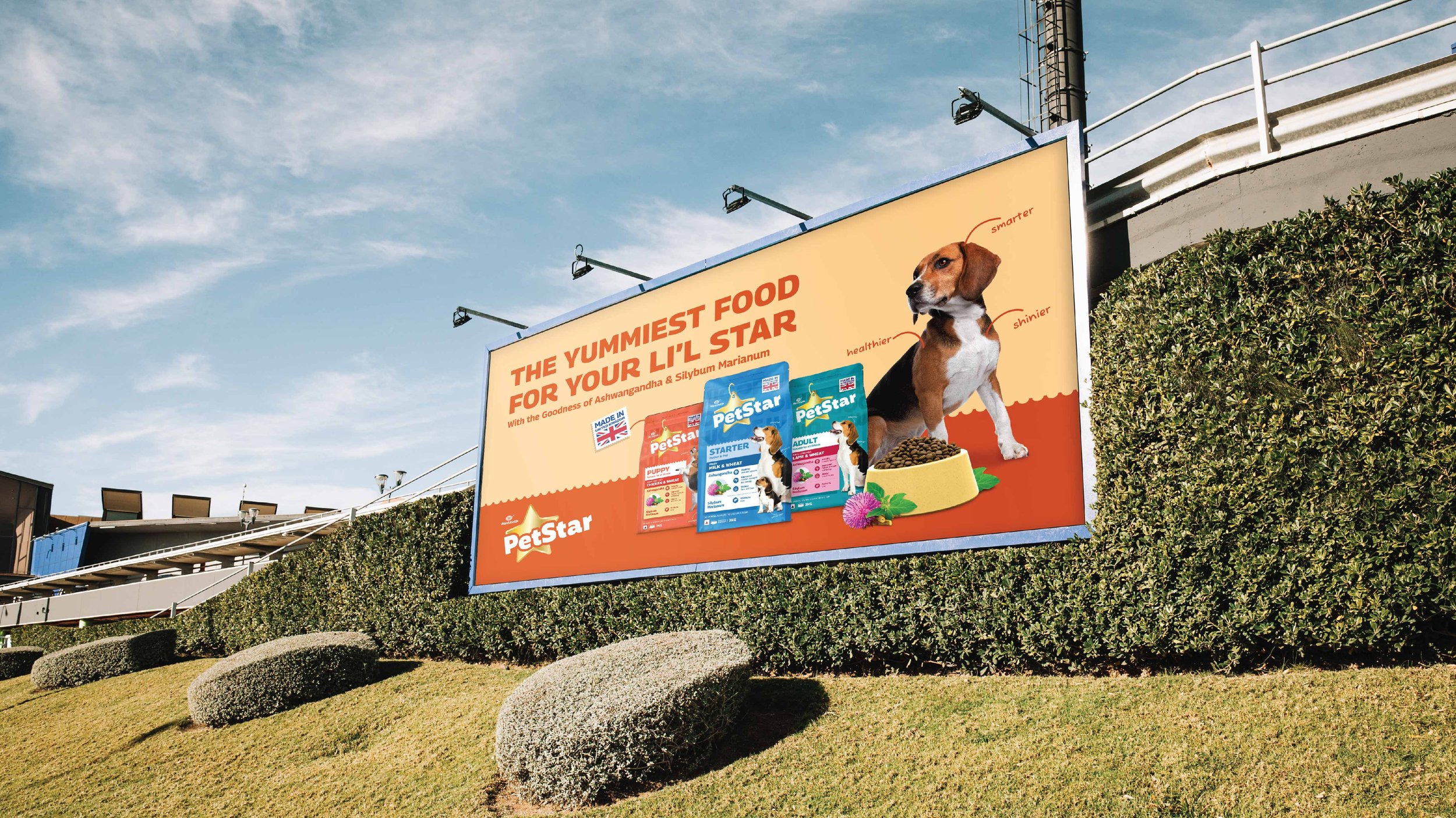
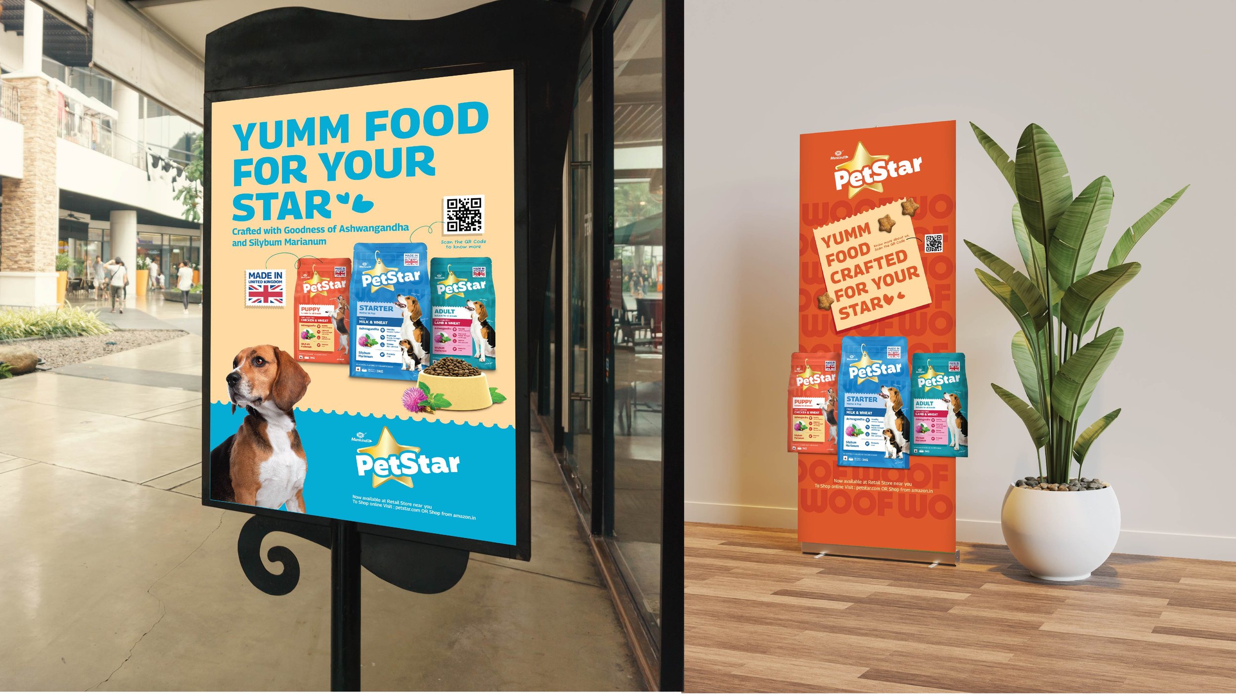
The typography for the brand name is slightly playful. As illustrated, it is accompanied by familiar dog visuals that adoringly look upwards at the central, in-focus element – a Golden Star, fashioned like a dog collar.

The Functional, the Premium and the Playful
To distinguish PetStar from its competition, we decided to highlight their unique selling points via an array of design choices. First, consumers can easily identify the source - ‘Made in UK’ – with its postcard-stamp treatment. UK-sourced pet foods are known for their premium appeal, with choice ingredients, stringent regulation processes and high-quality water backing up this reputation.
“PetStar aims to cater to the new generation of people adopting pets – i.e., the aforementioned Pet Parents. This is showcased via different elements, like a carefully worded, personalized letter on the Back of Pack or choosing a Beagle to be the ownable dog that would be displayed on the packaging. Beagles have a universal appeal and relate to both: strays as well as premium breeds, which made them ideal. ”
Second, the team decided to contain both: ingredients and benefits within a post-it style element. While the upper bands indicate the variant and intended dog-type (pup, adult etc.) the bottom focuses on the ingredient, with iconography and text conveying key benefits. This educates consumers about the category and enables quick decision-making upon purchase. Since PetStar also uses Indian ingredients like Ashwagandha, this becomes another differentiating factor and grounds the brand firmly within the Indian landscape.
The back of pack is largely functional, but presents a sizable amount of scientific information to consumers in an easy-to-understand, palatable format.
The metallic sheen in the logo and across other elements contributes towards its premium look and feel, replete with a background, and textured layer. Lastly, the Mankind logo reaffirms the scientific legacy that backs this product without stealing the show from PetStar’s own identity.

Enter Pet Parents
Taking consumer research and industry trends into account, our packaging and identity aimed to target newer dog parents that were open to trying out different, new brands. This is a challenge especially in the case of dogs, who are often loyal to the brand of their choice and don’t look to change things up.
““Bad Design is Smoke, while Good Design is a Mirror.” ”
PetStar aims to cater to the new generation of people adopting pets – i.e., the aforementioned Pet Parents. This is showcased via different elements, like a carefully worded, personalized letter on the Back of Pack or choosing a Beagle to be the ownable dog that would be displayed on the packaging. Beagles have a universal appeal and relate to both: strays as well as premium breeds, which made them ideal.
Elephant’s final design solution for PetStar was appreciated. The team had helped them launch a brand that adhered to category codes while using subtle ways to distinguish the brand, helping it stand out to new pet parents while educating them transparently about its benefits. Backed by Mankind’s legacy, PetStar is poised to release yet other products and expand their line while flexibly using our designs for other branding opportunities across posters, hoardings, shelf strips and more.