
Tata Sampann
Creating a Wholesome Visual Identity System for A New Range of Nutritious Snacking Options

The Focus
Tata Sampann, a brand associated with nutritive, wholesome goodness, wanted Elephant to design a visual identity system that echoed these qualities for their Dal-based snacks.
Focus elements: Vibrancy, inclusiveness, authenticity, goodness of ingredients
Wanted consumers to make the connect between wholesome snacking and Tata Sampann products
The Design
Elephant created a highly unique, differentiating visual identity for packaging that:
Blended impulse building essential for snacking with wholesome goodness
Since snacking represents gratification, while incorporating codes of fun & playful consumption
The ‘unbelievable’ combination of taste and guilt-free snacking was given special attention, with ‘inclusive’ nutritional information
Since ‘Dal’ in itself is supposed to ultimately provide simple satiation with the functional promise of healthy protein, the pack echoes these two core takeaways.
The Story
The Tata Group on a whole exemplify authenticity, reliability and the promise of quality. Their Tata Sampann brand has one core ideal: “Sarv Gunn Sampann”. This phrase finds its roots in Indian culture and mythology. It means: ‘that which incorporates everything that is good and wholesome’.
In the world full of foods being made ‘without’ fat, sugar or calories, Tata Sampann has the unique proposition of preserving or keeping goodness intact, of not removing anything that is essential part of a nutritious & balanced diet. After an entry into spices, staple and ready to cook categories, healthy, ready to eat snacks seemed like a natural extension.
Tata Sampann invited us to create a brand for someone who cares about nutrition. The packaging needed to highlight the promise of satiation that comes with snacking. However, it also needed to convey the nutrition promise within it, focusing on key differentiators like the fact that it was made up of Indian staples, and that it was an ideal option to snack on in-between meals. Without guilt, of course!
Lastly, the visual language needed to add vibrancy and playfulness since other products from Tata Sampann, have an underlying mainstream, center of plate communication.
Nu-Age Snacking
Snacking, by definition, is a game of instant gratification. We snack because our taste buds instinctively crave something yummy in-between meals. Something that can temporarily remove the feeling of hunger and replace it with lip-smacking satisfaction.
However, the nu-age snacker adds one more criterion when choosing their snacks – and that is the healthy, nutritious aspect. Since Tata Sampann provides this blend of taste and health, we needed to showcase this through the packaging.
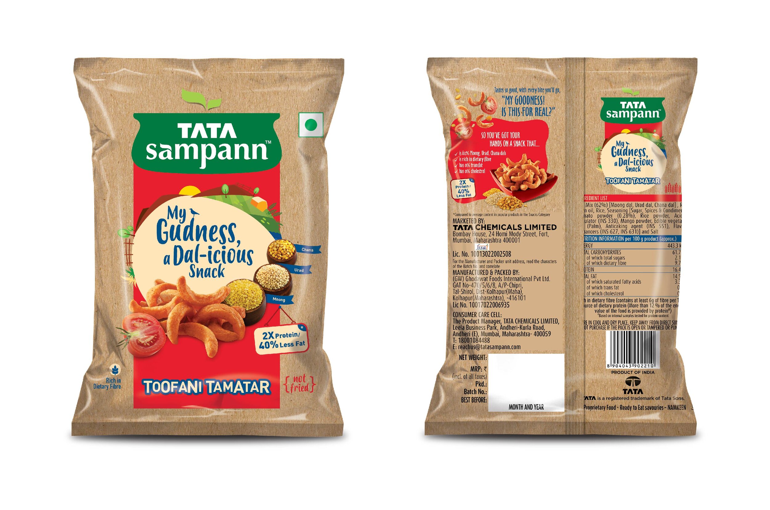
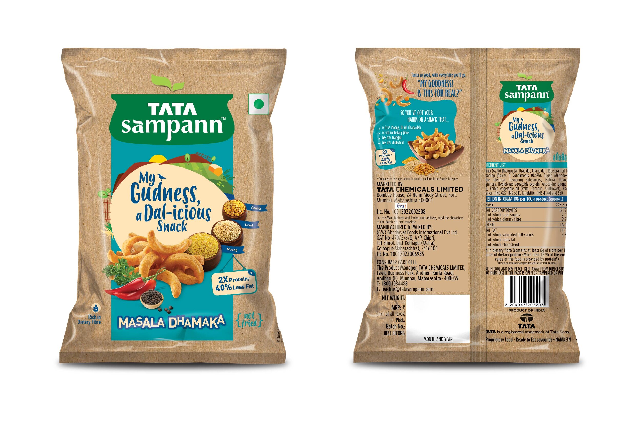
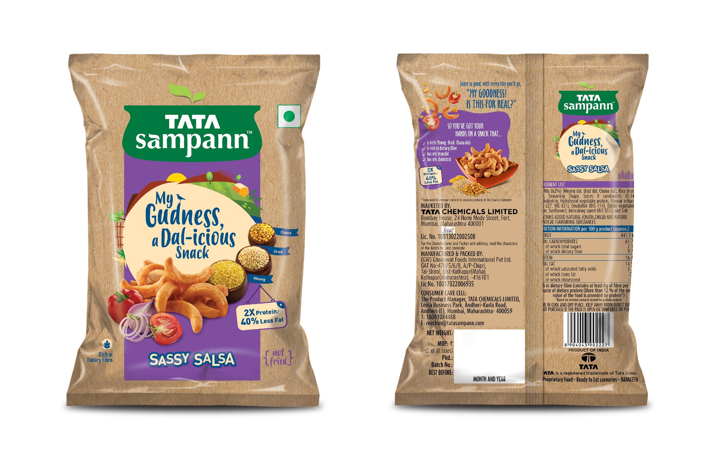
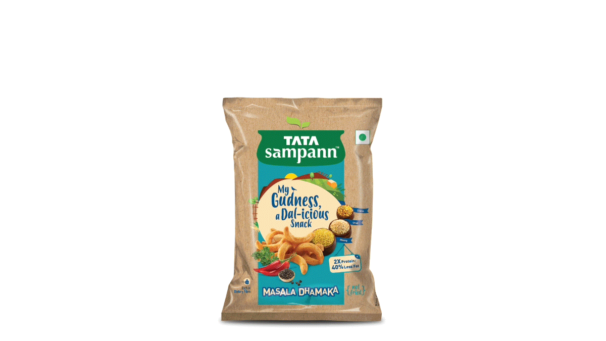
The core of the product was Dal, which made it the star performer on our package. Illustrations of lush, abundant fields helped showcase its origins.
Dal is a staple in Indian households. It is one of the main components of any wholesome meal. But looking at dal as a snacking option can be unconventional. Thus, you can see this playful message “My goodness, a Dal-icious snack”

“Snacking, by definition, is a game of instant gratification. We snack because our taste buds instinctively crave something yummy in-between meals. The nu-age snacker, however, adds one more criterion when choosing their snacks – and that is the healthy, nutritious aspect.”
Inclusive Differences
Most other snacks focus on the ‘exclusion’ principle when it comes to health. They highlight the absence of certain things, like fat, cholesterol and so on. Tata Sampann however, has an ‘inclusive’ philosophy in all their products. Paradoxical? Yes. Effective? Of course.
Our packaging included these differences by adding nutritional cues. Like the fact that it contains double the amount of proteins and is brimming with dietary fibers.
The back of the pack contained more of these differences differentiators for the customer’s consumer’s know-how.
“By adding inclusive, rather than exclusive differences, consumers buy the product for what it IS, rather than what it is not!”
Soothing yet Distinctive Earthiness
The snacking category, as a rough rule of thumb, works with vivid, bold colors. This is to indicate their fun and playful character and promises deliciousness. It also has instant visibility in crowded stores. You don’t simply open the pack because you’re hungry – you open it for all those promises that it makes over and above that.
Since these snacks are highly differentiated inside out, we wanted to deviate from those color codes, and differentiate the brand even further. Our color choices pronounce the brand as an alternative option to obvious junk food.
The overall impression is now crisp and simple: Taste compounded with healthy goodness! The product has been tested in one market and will be launched nationally in an enhanced version soon.
“Design creates culture. Culture shapes values. Values determine the future.”