

The Focus
Tata Sampann had created a new RTE + RTC brand, Yumside, directed toward young, progressive homemakers and working mothers alike with a large range of products in its expanding portfolio
Wanted to legitimize this range in an Indian market that cooks/consumes home-cooked food that is ‘not from a packet’.
Sampann wanted the team to design an apt logo with a distinct visual identity and packaging design system that would reflect its core promise: providing home-style goodness with restaurant-like taste
The Design
The team at Elephant created a fitting packaging system alleviating consumer concerns about RTE/RTC foods, making Yumside a go-to option for urban homemakers on cluttered shelves
The brand, via its packaging, communicated the abundance of fresh ingredients in natural settings to cue nutrition, freshness and deliciousness
The logo treatment ties in with the brand’s association with Tata Sampann (parent brand) while having a robust system that provides ample distinctions (veg/non-veg options, cuisine choices, serving suggestions and more) and remains homogenous at the same time
The Story

The RTE/RTC market and their offerings are something of a conundrum to Indian consumers. On one hand, the pandemic, along with urban, work-driven lifestyles being the norm, have led people to be more accepting about consuming RTC/RTE products.
However, perception is everything. Many urban women – often mothers – still fulfill an exhaustive number of roles both inside and outside the household. More often than not, the mother also becomes the family’s impromptu nutritionist where she keeps an eye on both: her husband’s and children’s diet.
“Elephant was tasked with creating a visual identity and packaging system that would alleviate consumer concerns about the RTE/RTC products in Yumside’s portfolio. This needed to achieve two things: enable Yumside to be the go-to RTE/RTC brand for their target audience in a market with other established players, while situating it under the recognizable parent brand, Sampann, which already had a wide range of staples, spices and other grocery items in its portfolio. ”
This leads to them being averse to RTE/RTC products when shopping, especially with many health experts actively discussing the negative impact of foods that contain preservatives and other chemicals – which often happen to be RTE/RTC products. Individual health and immunity have also been more active concerns since the pandemic.
Lastly, India’s culturally diverse array of foods, preparation styles and more have confined the scope for RTC/RTE foods, which homogenize the notion of taste and variety.
All of these factors led Yumside to seek design solutions from the team at Elephant. Yumside was providing a range of innovative, differentiated products that used MATS technology, which could successfully keep food fresh even at ambient temperatures throughout the supply chain. This was a groundbreaking revelation that needed to be communicated appropriately.
Our task, then, was to create a visual identity, packaging and a system that would alleviate consumer concerns about the RTE/RTC products in Yumside’s portfolio. This needed to achieve two things: enable Yumside to be the go-to RTE/RTC brand for their target audience in a market with other established players, while situating it under the recognizable parent brand, Sampann, which already had a wide range of staples, spices and other grocery items in its portfolio.
Providing Taste with Trendiness and Convenience
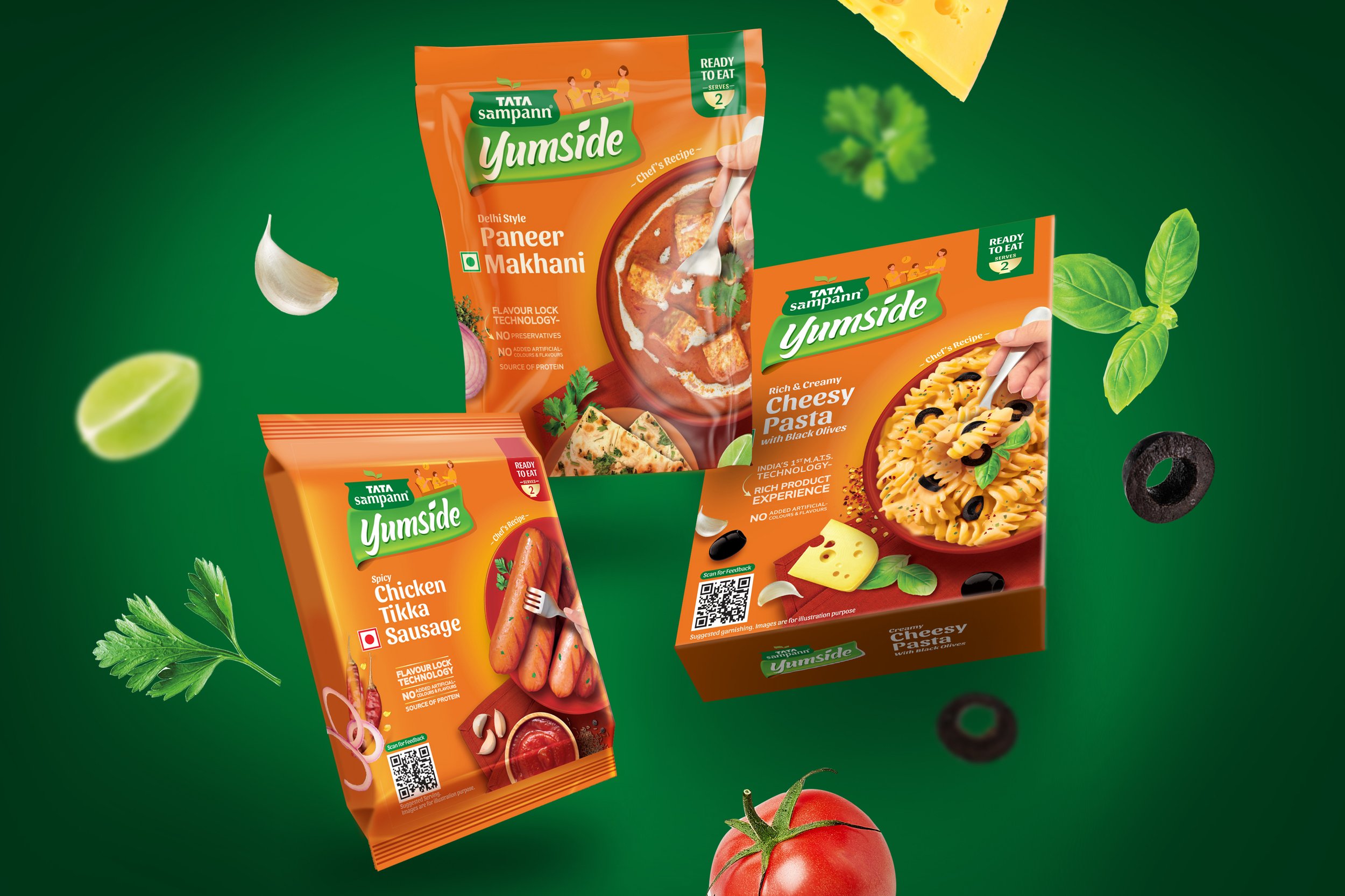
Convenience is probably the first thing that comes to mind when thinking about RTE/RTC products. The team remedied this by giving added attention to ingredients, preparation and taste and incorporating those cues in Yumside’s packaging design.
“Our team showcased nourishment and taste on the packaging by highlighting high-quality ingredients and the lack of preservatives/artificial colors and flavors. The aim was to do away with the idea of RTC/RTE being as good as home-cooked or restaurant-style fare. Brighter color tones, in addition to the focus on stylized ingredients supplement this narrative. ”
The key messaging was the ‘ability to enjoy delicious, home-cooked meals without the physical and mental load’. Yumside is aimed at young, progressive working women, mothers and homemakers who seek a quality solution to the challenge of not being able to find time for cooking, emergencies (like the cook being on leave or additional surprise guests) and maintaining a balance between home-cooked meals and external fare. They also seek food that is nourishing, healthy, tasty and trendy at the same time.
Our team showcased nourishment and taste on the packaging by highlighting high-quality ingredients and the lack of preservatives/artificial colors and flavors. RTC/RTE products can potentially match home-cooked or restaurant-style fare. Brighter color tones, in addition to the focus on stylized ingredients supplement this narrative.
Since Yumside’s products are stored and sold at ambient temperatures, a prevailing assumption is natural – how do they do it without preservatives? Well, science has come a long way and the packaging provides clear messaging on the technology used to achieve this (MATS), while also using fresh food colors.
“We opted for green with a leaf-like treatment for the Yumside logo and an approachable font for the text. This firmly puts it under Sampann, providing a reference to the well-known parent brand. We thus draw upon Sampann’s legacy of providing staples that are healthier, more nourishing and derived from natural/organic sources. ”
Convenience is given its due with other messaging on the front and the back of pack. An illustration of a family sitting down to comfortably enjoy a meal atop the logo draws attention to the aspect of ‘hassle-free’ enjoyment, while a clock element indicates how efficient and quick the meal is to prepare. The back of pack adds ‘Just Heat to Eat’ with other utility-driven content, all aimed to alleviate customer apprehension about doing too much to enjoy their favorite dishes in RTC/RTE formats at home.
Balancing Color and Effect
When it came to selecting the right color palette, the team had to engage in a balancing act. On one hand, Yumside wanted their packaging to draw people’s attention on online and offline shelves. Our team advised a deviation from experimental, flashy or evocative design – their product had to blend in with other pantry products, especially under the Sampann brand.
To achieve this, the team worked with conventional pantry color codes and gave them a slight edge, with warm orange dominating the pack, along with other warm colors like Green and Yellow to accompany it and add to the ‘nourishing, homely’ cues.
“To stand out, the RTE pack design language focuses on serving/plating suggestions and a hand holding cutlery indicating its ‘consumption-ready’ status. Conversely, RTC packs showcase the presence of a ‘maker’ via a hand holding cooking tools. This shows the customer the ease and convenience with which one can prepare the dish i.e., the process of preparation is highlighted as opposed to the end result. ”
The team went with green, with a leaf-like treatment for the Yumside logo and an approachable font for the text. This firmly puts it under Sampann, providing a reference to the well-known parent brand. This was crucial, since goodness is a Tata Sampann promise which serves to legitimize the product further. Here, we draw upon Sampann's legacy of providing staples that are healthier, more nourishing and derived from natural/organic sources.
Building a Comprehensive System for RTC & RTE offerings
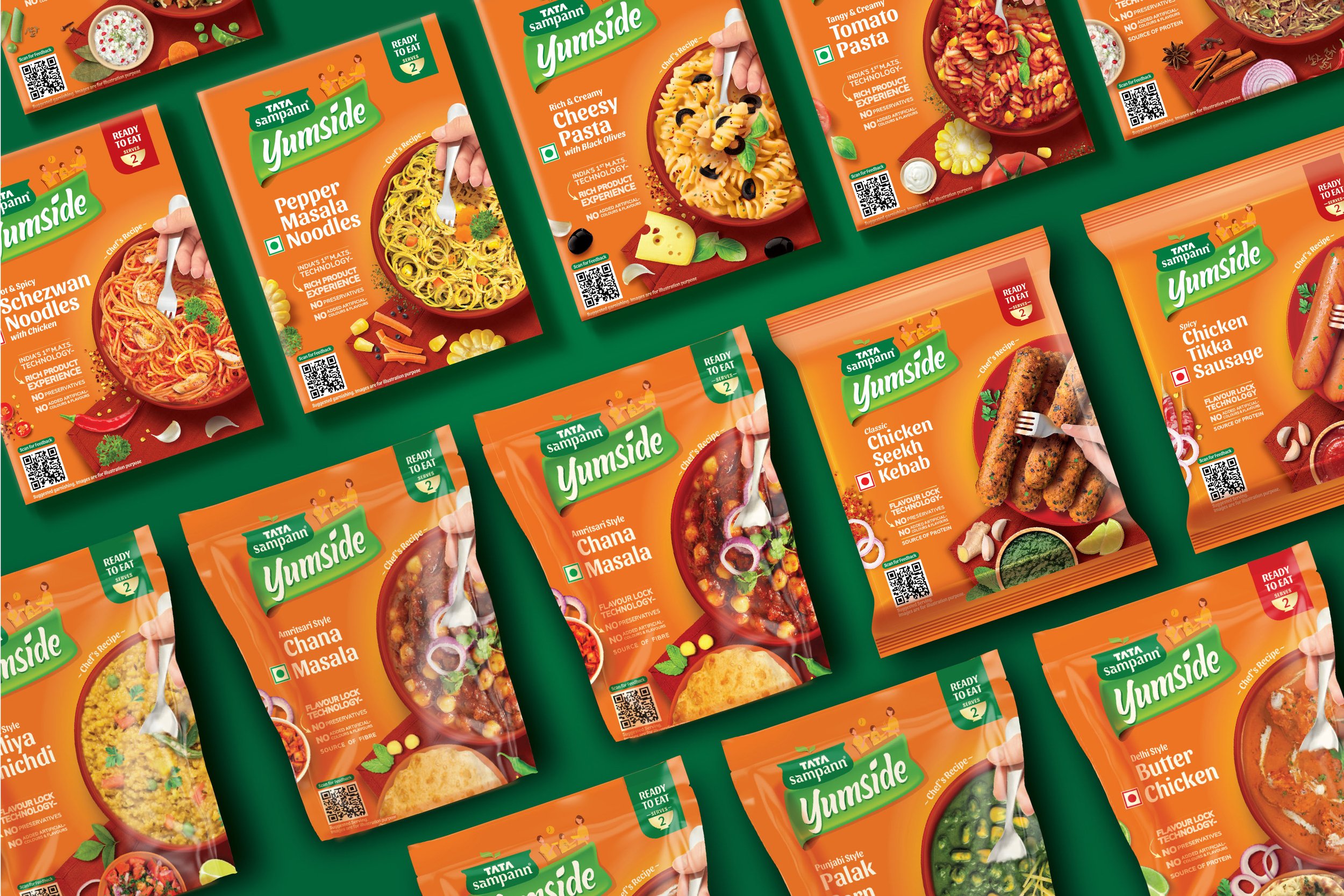
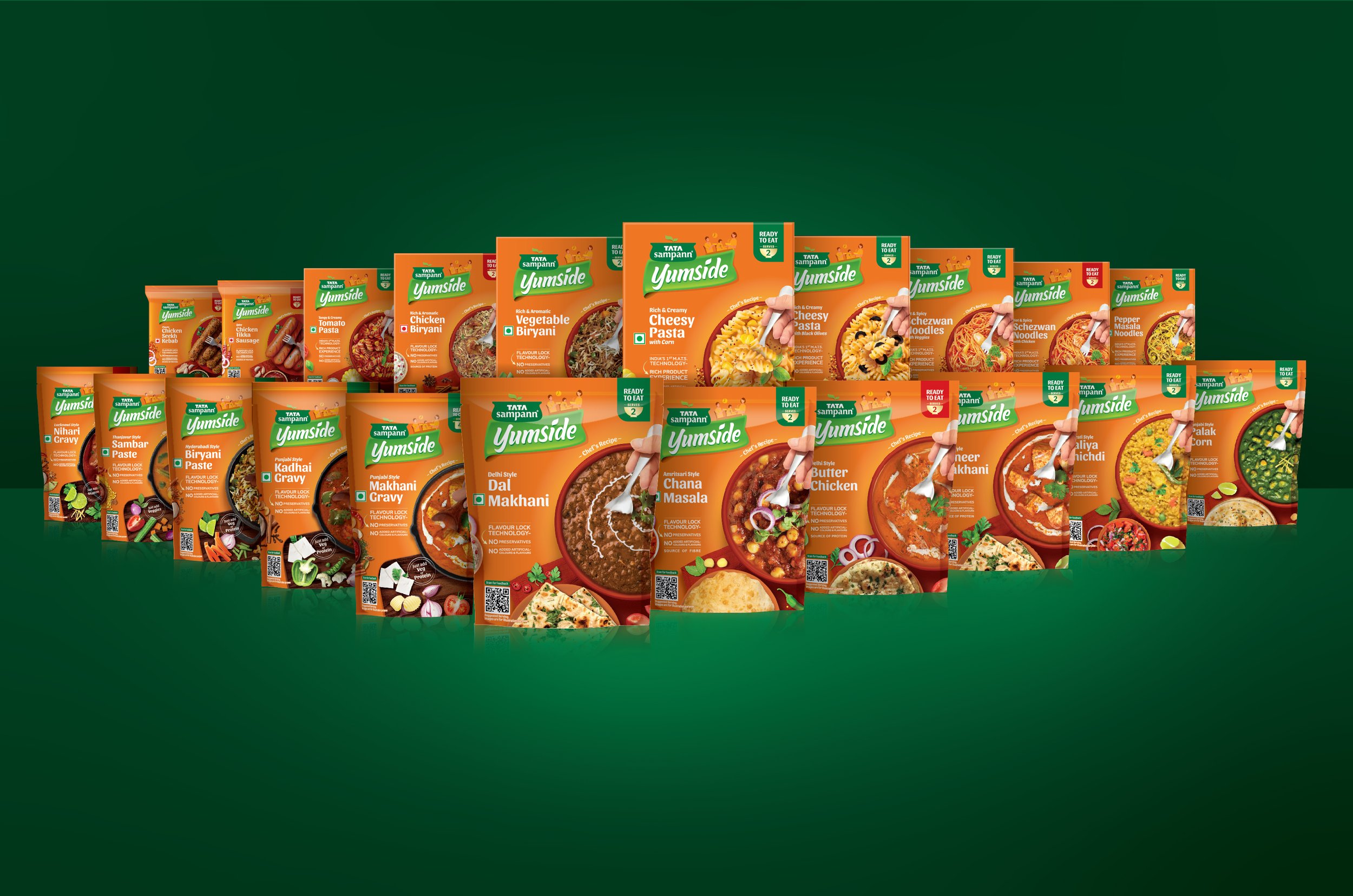
One of the greatest challenges in this exercise is creating a robust, homogenous (yet distinguished) packaging system for a brand with an ever-expanding portfolio. Yumside certainly had a rather extensive one with both, RTC and RTE offerings belonging to a host of different cuisines.
To stand out, the RTE pack design language focuses more on serving/plating suggestions and a hand holding cutlery indicating its ‘consumption-ready’ status. Conversely, RTC packs showcase the presence of a ‘maker’ via a hand holding cooking tools like a ladle in the central shot. This shows the customer the ease and convenience with which one can prepare the dish i.e., the process of preparation is highlighted as opposed to the end result. It also serves to legitimize the category further, where it is still home-cooking, but with an innovative edge that never compromises on taste.
“Simplicity, carried to an extreme, becomes elegance.”
To distinguish them, Indian RTC products showcase familiar accompaniments that go with the main dish, while the packs for international cuisines are focused on ingredients. The names for Indian dishes also have a prefix that indicates its origins/appeal, like ‘Delhi-style Dal Makhani’. International dishes, meanwhile, have content geared for cues of taste/texture, like ‘Cheesy Pasta’ or ‘Hot & Spicy Schezwan Noodles’.
The packaging system also distinguishes between vegetarian (Green on the serving quantity label) and non-vegetarian (Red) options for easy, quick selection.
All in all, the team at Elephant successfully reoriented Tata Sampann’s RTC + RTE offering, Yumside, to echo the proposition of easily accessing restaurant-style food safely, conveniently and promptly at home. The product blends into Sampann’s pantry of other staples but stands out on the shelf when compared to the competition – marking yet another project with a positive reception and outcome!