
Campus
Branding for Dynamism and Modernity | Campus
The Focus
Campus, one of India’s largest footwear brands, wanted to reinvent itself by undergoing a brand revamp
Current brand impressions rested on the tenets of nostalgia, durability and affordability – which the Campus team wished to expand on
Ultimately, Campus wished for more modern, contemporary overtones that would provide a firm footing for increased differentiation and competitive edge
The Design
The team at Elephant created a visual identity system, replete with changes in key elements like ownable brand elements, logo, the typeface and more
After extensive research, the key characteristics of the brand largely pivoted around contemporariness, energy, youthfulness and trendsetting
The visual identity aligned harmoniously with various applications, branding collateral and was flexible enough to be used in a versatile fashion across product ranges
The Story

Campus is one of India’s largest footwear brands, having witnessed tremendous growth since its incorporation in 2006. While it used to focus on active wear earlier, the Campus brand has now evolved to include athleisure, sports, casual and more under its aegis.
While the company, via virtue of its offerings, has managed to become a trendsetting brand for a significant portion of users, the brand iconography and visual identity needed to reflect this. A sense of contemporariness and modernity was lacking – which would be a hindrance in the future even as the brand planned to expand its portfolio even further.
“The new logo focuses on progressive, younger overtones with subtle changes in the swoosh element that indicates a newer direction. The logotype is similarly transformed, where subdued lower-case treatment gives way for a confident, upper-case avatar – signaling a confident transformation. We also took a more minimalistic, free-space approach that hinted at the new batch of tech-based offerings, where leveraging technology for their products would be the new norm. ”
Campus, hence, approached the team at Elephant seeking to revamp their visual identity – which also needed to extend to the various sub-brands like School Time and Go Crazy. The new identity also had to work cohesively with their social media and other branding propositions, requiring an alignment on multiple levels before execution on such a scale. Ultimately, the brand wished to evolve and acquire international appeal where the ‘premium’ feel and orientations toward fashion-savviness would be visible.
The Essence of Contemporary
When we look at contemporizing brands, there are many parameters of what modernity means and how it can be implemented. For Campus, we decided to go for a cluster of impressions, namely: fluidity, energy, contemporary-minimal/sleek as well as leveraging its existing youthful, trendy and adventurous overtones.
The new logo focuses on progressive, younger overtones with subtle changes in the swoosh element that indicates a newer direction. The logotype is similarly transformed, where subdued lower-case treatment gives way for a confident, upper-case avatar – signaling a confident transformation. We also took a more minimalistic, free-space approach that hinted at the new batch of tech-based offerings, where leveraging technology for their products would be the new norm. With these impressions in mind, we treated logo concepts across the board, contemporizing them with sleeker, dynamic fonts and pops of color that suited the particular segment.
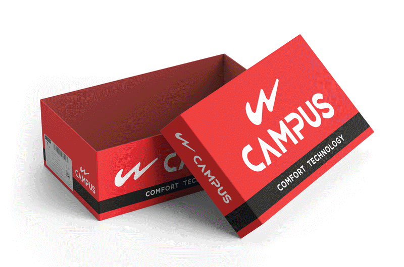
“Our system allowed for key propositions to be displayed succinctly with the logo and other typography – like breathable cushion technology for the School Time range, or the ‘crazy balls’ material in the Go Crazy range. The tonality matches the emotion of the range in question, lending more recall and cohesion to the brand property and product. ”
For instance, the Go Crazy segment (representing the spirit of youthful adventure) was treated with a blend of orange-blue for men and pink-purple for women, opting for neon-style, bright shades. On the other hand, the team featured a clock element within the logo for School Time (aimed at children) to suggest the importance of learning, growth and progress that is both integral and aspirational for the modern student

A sense of speed and agility has been implemented across segments to homogenize the visual identity system. Speed defines the contemporary lifestyle. From breakthroughs in communication technology and transportation to processes aimed at maximizing productivity, there are many reasons as to why the average human can do a lot more in a standard 24-hour day – and Campus becomes the go-to companion that can keep up with this lifestyle, be it for adults, teenagers or even children.
Maximizing Applications
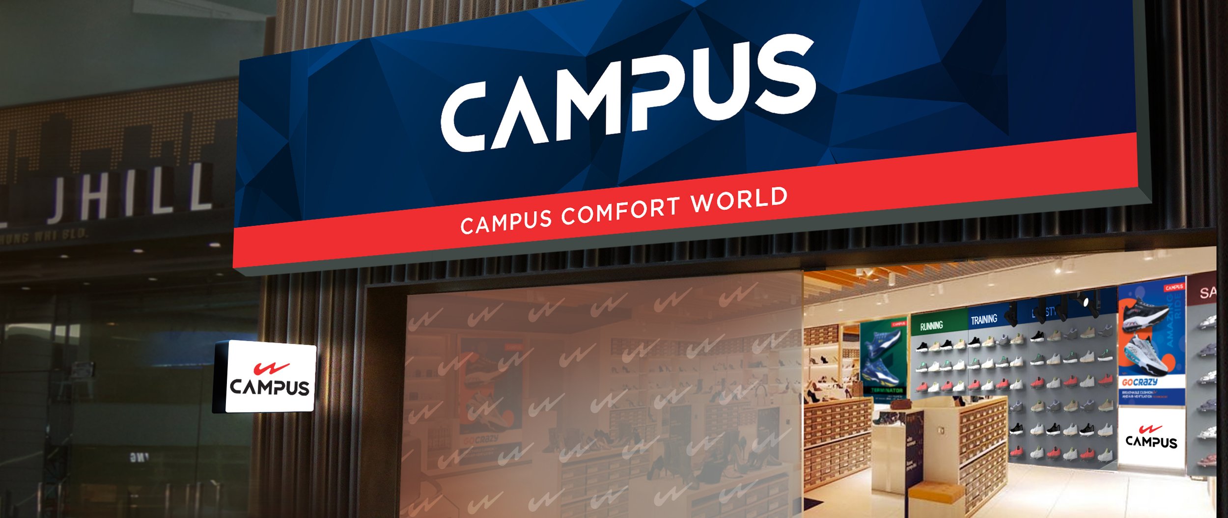
Versatility and adaptability are the hallmarks of any good visual identity system – this is extremely evident in our design efforts for Campus, where the system has to scale both vertically and horizontally as far as applications and key propositions are concerned.
“Campus tasked us with developing collateral for their stores, OOH advertising and even extended it to include their stationary, apparel and more. In that vein, we developed brand collateral that aligned with their overarching advertising and brand strategy. This included leveraging their work with Mouni Roy – the brand ambassador for certain segments – whose presence reinforces the youthful, speedy energy that the brand stands for. ”
All logos and ownable brand elements were subsequently applied to the packaging material – be it cartons, shoe-wrapping papers, tagging items, bags and more. Our system allowed for key propositions to be displayed succinctly with the logo and other typography – like breathable cushion technology for the School Time range, or the ‘crazy balls’ material in the Go Crazy range. The tonality matches the emotion of the range in question, lending more recall and cohesion to the brand property and product.
Our work for these ranges led Campus to extend the scope of the project to also include visual identity development for the Campus Men and Women (Economy, Premium and Luxury) ranges, Campus Kids, the brand for children for all their activities beyond the classroom as well as more premium offerings like products that included their Air Capsule technology and Oxyfit, a product tailored for maximizing comfort.
Beyond the Product
Our visual identity system grew in leaps and bounds even as potential applications became more apparent. Campus tasked us with developing collateral for their stores, OOH advertising and even extended it to include their stationary, apparel and more.

““There is no such thing as a boring project. There are only boring executions.” ”
In that vein, we developed brand collateral that aligned with their overarching advertising and brand strategy. This included leveraging their work with Mouni Roy – the brand ambassador for certain segments – for cutout standees and counter branding while also utilizing proprietary elements for 3D posters, shelf talkers, OOH creatives, the fascia and more.
All of these applications simply lent credence to the foundations of our design system that withstood applications well beyond its earlier scope while achieving the desired result, where the brand shows clear signs of evolution without losing the essence of their existing brand values, propositions and more. This overhaul signals the arrival of a brand that now takes its offerings to a higher level, where it can compete across segments with yet other competitors while providing their existing clientele with a refreshing new avatar that adheres to the principles of modernity and progress.